Product
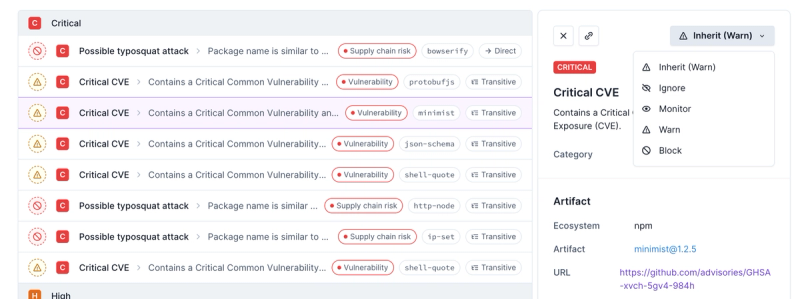
Introducing Enhanced Alert Actions and Triage Functionality
Socket now supports four distinct alert actions instead of the previous two, and alert triaging allows users to override the actions taken for all individual alerts.
@leafygreen-ui/popover
Advanced tools
Readme
yarn add @leafygreen-ui/popover
npm install @leafygreen-ui/popover
import Popover from '@leafygreen-ui/popover';

<button
  className={containerStyle}
  onClick={() => this.setState({ active: !this.state.active })}
>
  Popover
  <Popover
    align="bottom"
    justify="start"
    active={this.state.active}
    usePortal={true}
    spacing={10}
  >
    <div className={popoverStyle}>Popover content</div>
  </Popover>
</button>;
<button class="leafygreen-ui-79elbk">
  Popover
  <div class="leafygreen-ui-1hyfx7x"></div>
</button>

<div align="bottom" justify="start" class="leafygreen-ui-1t5dnko">
  <div class="leafygreen-ui-ii2v5b">Popover content</div>
</div>
The popover component will be automatically positioned relative to its nearest parent. If usePortal is set to false, then it will be positioned relative to its nearest ancestor with the CSS property: position: absolute | relative | fixed.
| Prop | Type | Description | Default |
|---|---|---|---|
active | boolean | Determines whether the Popover is active or inactive | false |
align | 'top' | 'bottom' | 'left' | 'right' | 'center-horizontal' | 'center-vertical' | A string that determines the alignment of the popover relative to the refEl. | 'bottom' |
justify | 'start' | 'middle' | 'end' | 'fit' | A string that determines the justification of the popover relative to the refEl. Justification will be defined relative to the align prop | 'start' |
children | node | Content that will appear inside of the <Popover /> component | |
spacing | number | Specifies the amount of spacing (in pixels) between the trigger element and the content element. | 10 |
className | string | Classname to apply to popover-content container | |
adjustOnMutation | boolean | Should the Popover auto adjust its content when the DOM changes (using MutationObserver). | false |
onClick | function | Function that will be called when popover content is clicked. | |
usePortal | boolean | Will position Popover's children relative to its parent without using a Portal, if usePortal is set to false. NOTE: The parent element should be CSS position relative, fixed, or absolute if using this option. | true |
portalContainer | HTMLElement | null | Sets the container used for the popover's portal. NOTE: If using a scrollContainer make sure that the portalContainer is contained within the scrollContainer. E.g, passing the same reference to scrollContainer and portalContainer. | |
scrollContainer | HTMLElement | null | If the popover portal has a scrollable ancestor other than the window, this prop allows passing a reference to that element to allow the portal to position properly. | |
portalClassName | string | Passes the given className to the popover's portal container if the default portal container is being used. | |
popoverZIndex | number | Sets the z-index CSS property for the popover. | |
| ... | native attributes of Portal or Fragment | Any other properties will be spread on the popover-content container |
| Prop | Type | Description | Default |
|---|---|---|---|
refEl | HTMLElement | You can supply a refEl prop, if you do not want the popover to be positioned relative to it's nearest parent. Ref to the element to which the popover component should be positioned relative to. | null |
FAQs
LeafyGreen UI Kit Popover
The npm package @leafygreen-ui/popover receives a total of 28,448 weekly downloads. As such, @leafygreen-ui/popover popularity was classified as popular.
We found that @leafygreen-ui/popover demonstrated a healthy version release cadence and project activity because the last version was released less than a year ago. It has 5 open source maintainers collaborating on the project.
Did you know?

Socket for GitHub automatically highlights issues in each pull request and monitors the health of all your open source dependencies. Discover the contents of your packages and block harmful activity before you install or update your dependencies.

Product
Socket now supports four distinct alert actions instead of the previous two, and alert triaging allows users to override the actions taken for all individual alerts.

Security News
Polyfill.io has been serving malware for months via its CDN, after the project's open source maintainer sold the service to a company based in China.

Security News
OpenSSF is warning open source maintainers to stay vigilant against reputation farming on GitHub, where users artificially inflate their status by manipulating interactions on closed issues and PRs.